
BLENDING INTO A CROWD : WHAT COLOUR CAN DO FOR ARCHITECTURE
North Bondi Amenities, NSW
I am passionate about developing colour palettes (for buildings) that are both memorable and in harmony with their contexts. Site analysis and research is central to what I refer to a ‘storytelling through colour’ approach.
Of the many collaborations I have worked on with Sam Crawford Architects, our first - a public toilet - is still one of my favourites.
Bondi Beach is big, lively, beautiful … and people certainly don’t go there to look at a ‘dunny’ block.
So, for the North Bondi Public Amenities, colour was used to camouflage and harmonise the toilets with the environment rather than to make them stand out.
I began with observing the context, to try to understand how a new building might belong in that place, and what type of relationship it could have to the site. I look at the surrounding buildings, their shapes, materials and colours. I look at the vegetation, and at the ground plane - the natural geology or materials used to cover the natural substrate. I observe the weathering of things, and I also look at how the new building will be framed - is there sky or land behind it? Is it surrounded by dense foliage? What else is in the picture, and what kind of relationship do we want the new building to have with its neighbourhood? All these elements provide direction: not only for the materials and colours, but also the arrangement of them.
The amenities building subtly mimics its surroundings.
In setting the ‘horizon line’ through the building, I was able to give an ordering principal for the arrangement of materials, while referencing maritime structures such as piers and plimsoll lines. This device deliberately leads the eye back out to Bondi’s wide horizon.
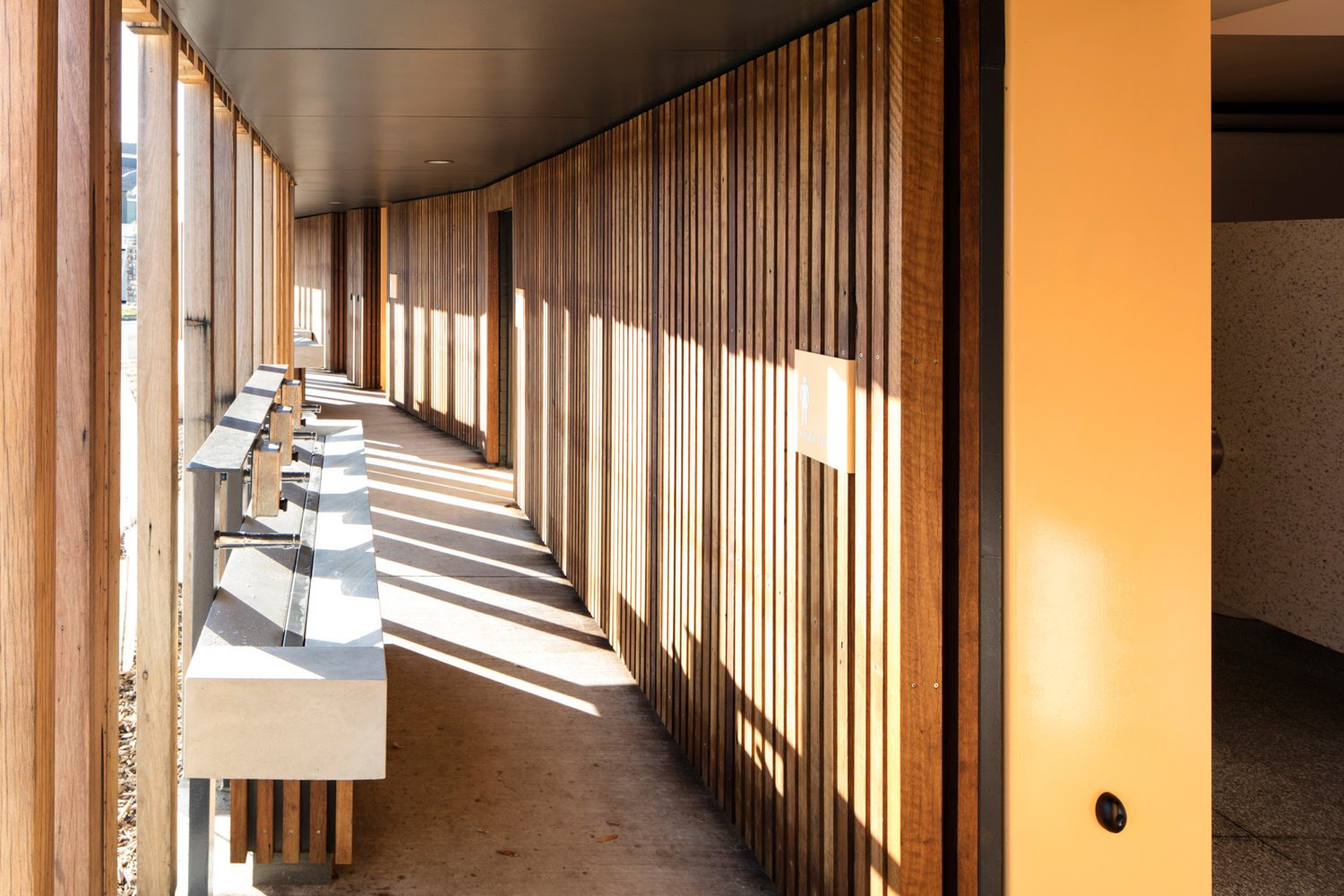
Interestingly, the black battened sewerage pumping house although larger than the toilets themselves, somehow disappears and becomes almost invisible. This dark background allows the two toned timber battens on the toilets to become more striking.
Different treatments on the battens and the colours painted behind the battens adds depth and changeability.
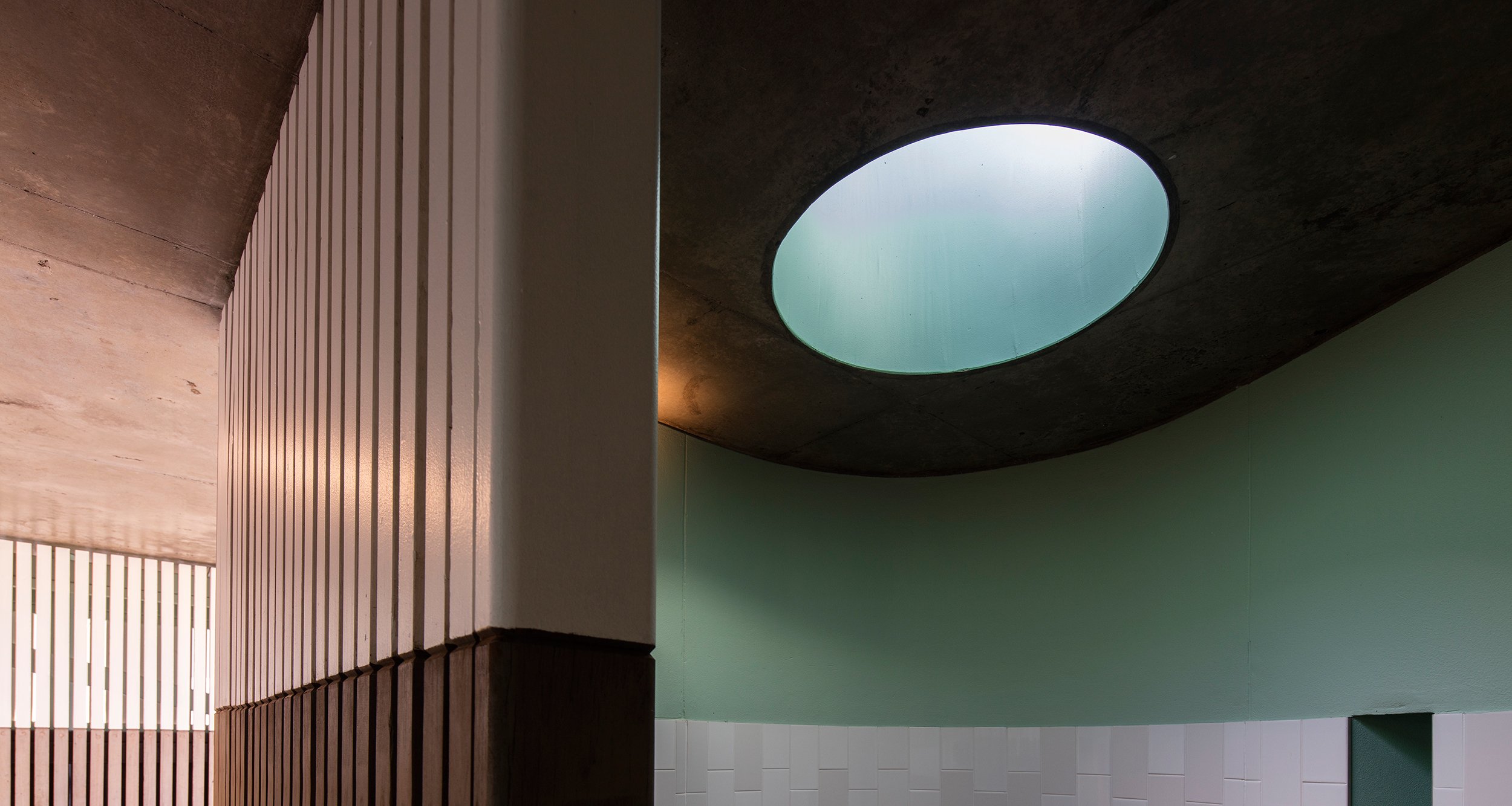
In considering the interior, our aim was to prolong the sensation of being at the beach. We wanted to avoid creating a closed in space, which experientially would ‘take the user off the beach’.
The architects cleverly extended the building program beyond the interior, with outdoor communal washbasins, outdoor showers, a generous seat and a bus stop incorporated into the façade.
The material palette and internal design was intended to support those gestures and the colours and materials flow seamlessly from outside to inside.
Light and air penetrates, the finishes, colours, materials return the user to the beach environment.
The building is subdued, the colours pre-faded as if seen through the sea spray. The roof garden is another important element which, along with the horizon line, allows the building to appear to merge with the landscape beyond.
This strategy allows Bondi Beach itself to shine, and the humble amenities block to play its essential role supporting public life and public health.
The second public toilet we designed used the same strategy of site analysis. In responding to a different context however the results, although strongly related, are quite different.
The Marks Park Public Amenities sit at the top of a sandstone headland, in Tamarama. The colour and material palette is inspired by the sandstone cliffs and the amenities themselves function like a shelter, at the top of a windy hill.
The beautiful colours of Sydney sandstone; oranges, pinks, creams, browns, greys and blacks find their way into the colour palette of the toilets. The timber battens weather to grey over time, sitting gently on the site.
It’s interesting to notice that this building also has its own ‘horizon line’ expressed in the timber battens, and that the building itself has a completely different relationship with the ocean horizon. The choice of a black ceiling on the verandah/communal washbasin space was a deliberate move to de-emphasise and camouflage the ceiling. A white ceiling, as well as getting grubby over time would compete for attention, whereas the black ceiling becomes a shadow and virtually disappears.
This allows the visitors eye to glide out of the building and back to the spectacular ocean view.
Another collaboration with the talented team @samcrawfordarchitects
Location: Marks Park, Marks Lane, Tamarama NSW 2026
Project Team
Architecture: Sam Crawford Architects
Builder: Grindley Interiors
Project Manager: Complete Urban
Structural Engineer: Cantilever
Graphic Design: Deuce Design
Photography: Brett Boardman
Marks Parks Amenities, Bondi, NSW