
When Destroying Buildings with Colour is a Good Idea
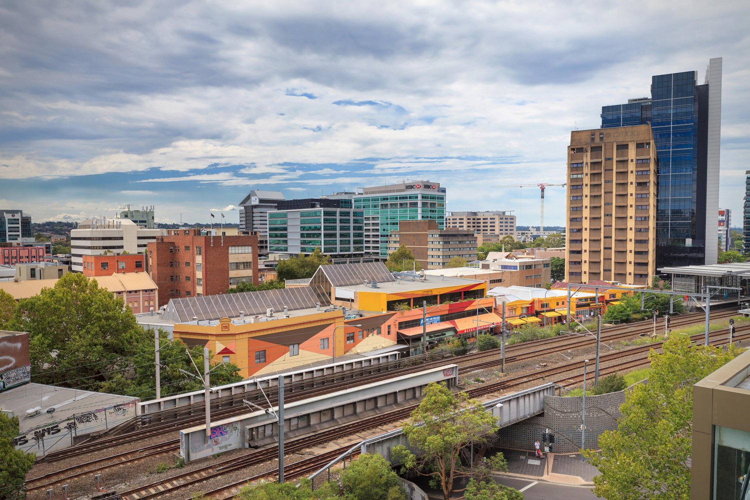
Darcy St Activation, Parramatta. Photo: Doug Riley
This month I’m preparing for Design Speaks: The Architecture Symposium in Melbourne, the theme of which is “Acts of Generosity”. The Symposium, curated by Amy Muir and Rachel Neeson aims to “expand the boundaries of civic design, looking beyond the formal structures of traditional ‘civic’ design typologies – the library, the law court, the town hall – to explore projects that consciously contribute to the evolution of architecture and, more importantly, support the evolution of society.”
So, in the spirit of ‘killing two birds with one stone’ but without harming any actual birds, my talk is about one of my earliest public commissions, the Darcy St + Laneway Activation in Parramatta. The project in question was commissioned by Parramatta Council for building assets they owned and planned to demolish. This project gave me the opportunity to destroy the buildings first, by using paint instead of a sledgehammer.
The symposium theme allows me to revisit one of my favourite topics which is the threat that colour poses to architecture. ‘Colour’ can destroy ‘Form’ as easily as paper wins against rock in a game of Paper, Scissors, Rock. The rock may be stronger but the paper, (or paint) in this case, hides the rock and renders it irrelevant.
Wielding colour is my (super) power, but rest assured I try to do it wisely and for the common good.
To give you some background - I feel it's reasonable to say that Civic Architecture tends to favour durable and high quality materials in which colour is an intrinsic property, such as stone, concrete, brick, or metals like copper and zinc.
For example, both the older Ballarat Civic Hall and new Govhub building by John Wardle Architects (pictured below) demonstrate an emphasis on materiality rather than ‘applied colour’.
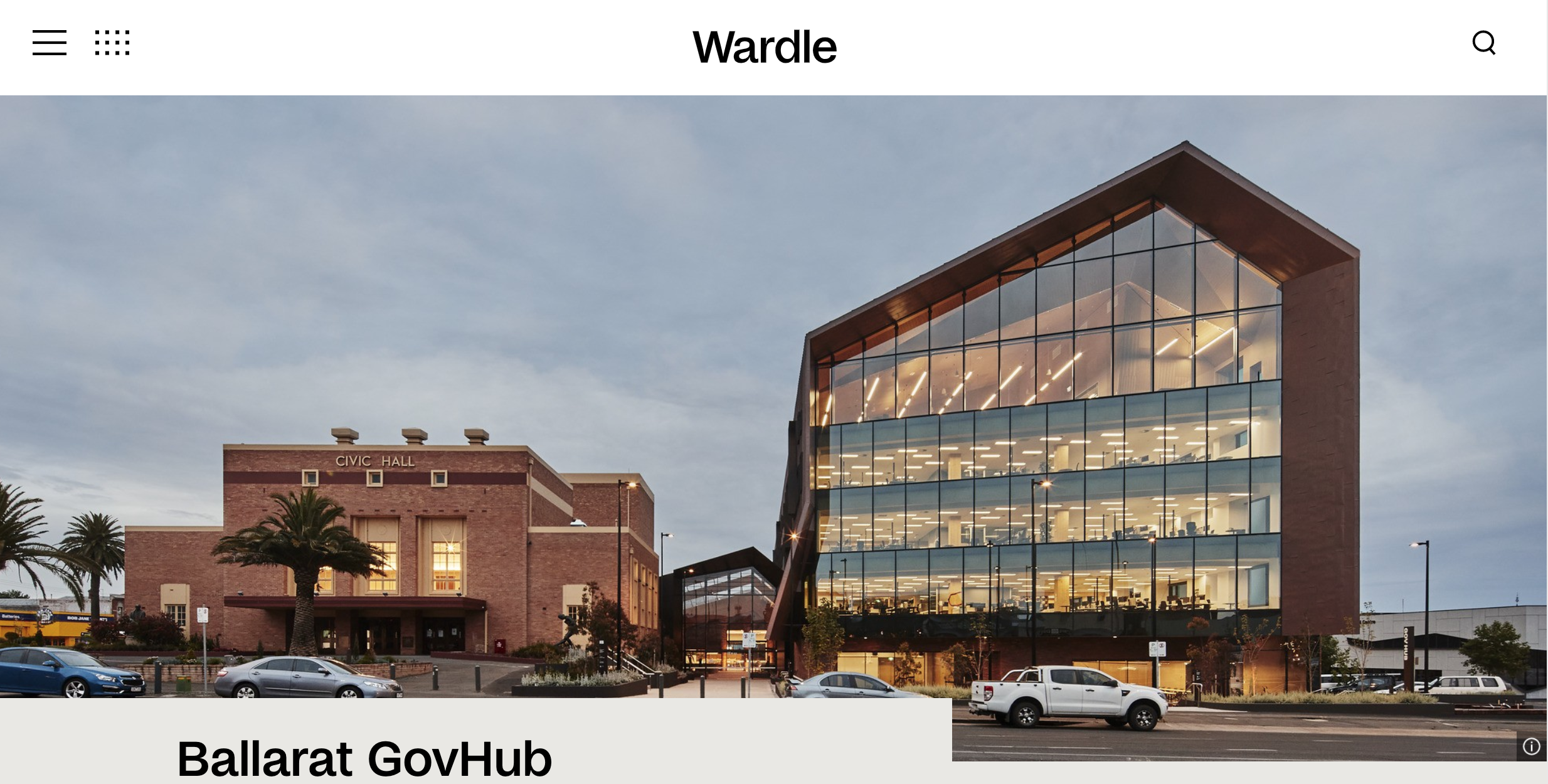
Ballarat GovHub by John Wardle Architects, Photo: Peter Bennets
In comparison, paint is often seen as a poorer option; less durable, fake and even deceptive. Paint hides things. Or even worse - turns buildings into advertisements. If you think of all the Kennards storage buildings you’ve seen, chances are you would find it harder to recall which building was a lightweight shed, which was a converted old brick warehouse or tilt-up concrete, but you’d definitely know it was bright orange and blue in colour. Architects would not normally use the Kennards colour approach for a public building. Would they?
You can read a little more about how and why I used a similar tactic for Darcy St here.

Kennards Self Storage, Photo: Wikicommons
Sign up to Lymesmith’s newsletter for monthly musings on colour and architecture.