
Geological Colour Cues for Architecture

200 George St, EY Centre by FJMT (photo: Brett Boardman)
“One of the biggest problems with architecture is we don’t look at the city when we’re designing in it; we don’t look at the countryside as we’re designing in it. We only look at those contexts as stages to showcase our creativity. But the context is everything. It should be about the amplification of the context, rather than the amplification of the objects we put in it.”
Kevin Low, Small Projects
One of the best things about holidays is the opportunity to take in the colours of new landscapes. I could look at rocks and plants and the sky all day. Every landscape is a unique context, with a unique set of colour relationships. Whilst some people see form before they see colour and some notice patterns or tonal differences first, I see colour. I’m obsessed by the subtle differences between colours of one place and another, one plant and another, one leaf and another. From the macro to the micro, I look at colour first.
Increasingly I feel that to understand the colour ‘field’ of a given place, one of the best places to start is with the geology, even if it is hidden or not immediately obvious. This is why Kevin Low's words resonated with me - I think the colour scheme of a building should be an amplification of its site - colours and materials used in buildings should be a reflection of place, of 'country', and by doing this the building can foster better connections between people and place.
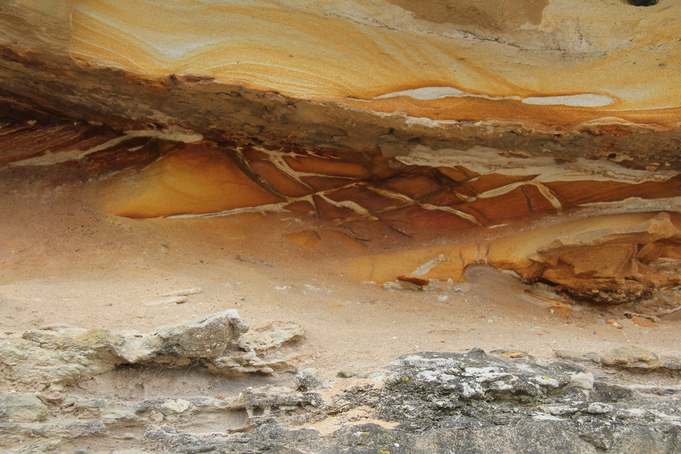
Sandstone at Tamarama
Sydney’s golden sandstone is the starting point for any contextually sensitive building colour palette in that city. Meaning, if you use white on a building in Sydney, make it a warm white. For black, make it a warm black. This doesn't mean you can't use blue or green or pink - it means that when choosing any colour at all, the best outcome will be achieved by reviewing each colour against a sample of sandstone (or the bedrock of the particular site) and selecting the tones that look the most beautiful together. On a sandstone site, the best pink will be a peachy warm pink, the best blue will likely contain some orange and appear slightly grey.
An example; two recent projects near Circular Quay, the EY Centre at 200 George St, by FMJT and Quay Quarter Tower by Danish architects 3XN are both highly energy efficient, sophisticated new high rise towers in the city centre.
Described as 'intrinsically Sydney' by Phillip Oldfield, the EY building's curved glass and timber facade produces a warm almost liquid feeling like honey. The building glows day and night, and is incredibly beautiful both up close and from a distance. It is innovative and contemporary, yet is complementary to Sydney’s heritage sandstone buildings.
This was a deliberate strategy of architects FJMT,
“We wanted to see if we could make a city tower grow out of its site, being the source of its inspiration, material and character; and in doing so somehow reveal, interpret and reinforce this unique site and sense of place.”
In contrast, the renovated Quay Quarter Tower features a stark white chunky facade grid and grey glass. There’s token sandstone facing on the podium but no harmony or sophistication in the relationship between the podium materials and what rises above it. It is visually jarring in the cityscape of Sydney. Even sadder is that its companion building, AMP Tower, the first skyscraper in Sydney is such a beautiful, modern and rich precedent in terms of its materiality. The adjacent precinct Quay Quarter lanes are by contrast highly contextual, employing materials and colour highly sympathetic to the heritage context, all in the warm spectrum and springing from the beauty of the sandstone underfoot.
Mark Merton wrote in Architecture Australia, that "... almost every major city in the world is now home to generic glass-box office towers, with little relationship to the climate and environment they’re in or to the unique context and characteristics of the urban realm."
It's my belief that every building should respond to local conditions; to climate, to geology, to landscape, vegetation and to local precedent. A buildings colour and material palette are integral to the creation and expression of a unique Australian culture.
As a designer, I work towards deepening my knowledge and awareness of place in every project.

Quay Quarter Tower by 3XN, voted world’s best skyscraper for its innovative renovation of an existing high rise building, is lacking in its material response to the local context.
A Lymesmith project directly inspired by the colours of Sydney sandstone is the humble Mark’s Park Amenities, a collaboration with Sam Crawford Architects.
Sign up to Lymesmith’s newsletter for our monthly musings on colour and architecture.