
When the Opposite is True
‘Warm Vessel’ coloured courtyard project Darlinghurst (photo: Brett Boardman)
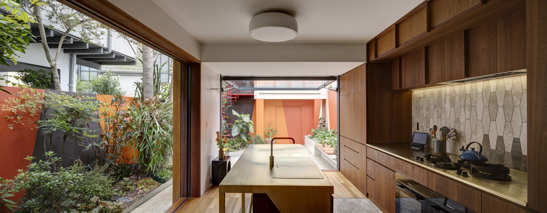
Expanding Space in a Tiny Courtyard
Warm colours advance, cold colour recede. Right, yes? The way colour acts on a building, the way it can emphasise or de-emphasise a particular aspect of architectural form is something I study and think about a great deal. And generally speaking, I’m confident in saying that cool colours produce a more spacious feeling than warm colours.
However, when colour is applied in three-dimensional environments (i.e, architecture) there are multiple factors and complexities affecting the behaviour of those colours. Simplistic rules of thumb are useful starting points but they are not always correct, or useful as decision making tools.
‘Warm Vessel’ is the name of a recent project in Darlinghurst, in which I was asked to propose a colour strategy for a small courtyard garden. This involved painting the back walls of the terrace house, the side boundary walls and the façade of the studio/garage that formed the rear boundary and enclosed the courtyard.
In these inner-city blocks, courtyards are usually tiny walled gardens which are overlooked and overshadowed, and yet provide precious private outdoor space. They’re a kind of inside/outside preposition – almost like another room in the house, except without a roof.

‘Warm Vessel’ coloured courtyard project Darlinghurst (photo: Brett Boardman)
The renovation of the terrace house by Sam Crawford Architects included installing more windows and openings to improve the connection between the interior and the courtyard.
Internally the house features beautiful finishes in timber and brass with stone tiles. The interior walls are a soft shade of white, all selected by the architects.
I was given the task of investigating possibilities for colour on the walls in the garden space, something that was ‘not exactly a mural but more than a single colour’.
I looked at the walled garden as an oasis which needed to feel very welcoming and complementary to the internal spaces from which the courtyard is seen. In the renovations, the existing red brick pavers were to be replaced with a white cement slab. Concerned that this might make the space uninviting in winter, I felt that a warm palette would best compliment the warm neutral tones of the architecture and the deep greens in the lush garden (by Sue Barnsley Landscape Design).
The vibrant, earthy red, orange, pink and brown palette gather the garden in a warm embrace.
Wonderful colour effects are produced inside the house. Colour shines and spills, it seeps in, changing with weather and season. From the front door, it’s possible to detect a warm glow emanating from deep within.
The garden colours beckon and invite one to go outside. The colours have the effect of making the interior of the house feel larger, even whilst boldly ‘declaring’ the site boundary. I think it works because the eye is drawn outside by the unexpectedly rich colour, somehow giving the impression that the boundary of the room is not the walls of the house, but the walls of the courtyard beyond.
It’s a curious reversal of what you may expect.
Warm colours, expanded space.

‘Warm Vessel’ coloured courtyard project Darlinghurst (photo: Brett Boardman)
A Lymesmith a collaboration with Sam Crawford Architects and Sue Barnsley Landscape Design
Sign up to Lymesmith’s newsletter for our monthly musings on colour and architecture.