
COLOUR HEALING BETWEEN MOUNTAINS

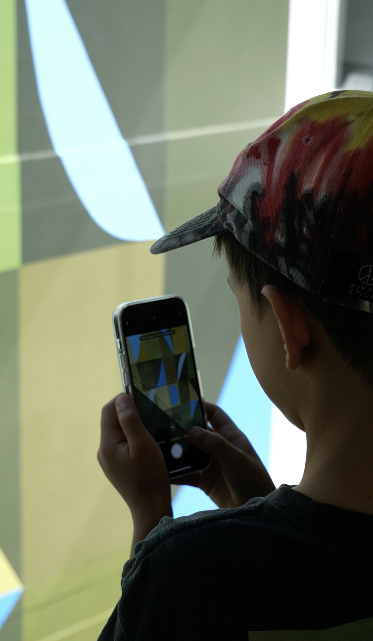
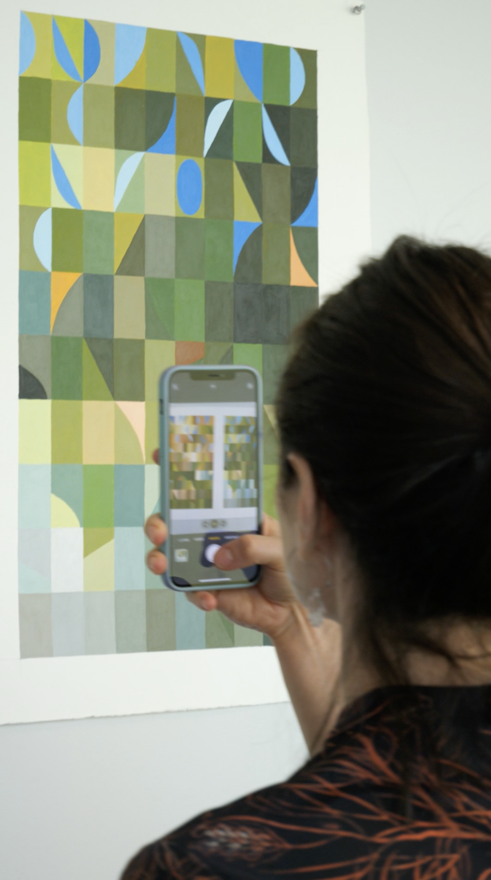
Between Mountains, Cento Building, Canberra. Photo: Dale Wowk
I got this MURAL COMMISSION because of poor architectural design
Buildings with deep floor plates create many problems - restricted access to light and ventilation, single orientation apartments, internal corridors that are creepy and dark … we’ve all experienced them. Better planning regulations, better design and less developer greed can avoid these issues by building two buildings on such a site, with a garden in between. All the apartments would have had a northern aspect and cross ventilation.
Back to reality - instead of all those good things, the Cento building has a seven storey hole in the middle of it with a couple of ferns planted at the very bottom. This ‘hole’ is a light well and brings natural light into the internal circulation corridors on each floor. Three sides are glass, and on the north facing side? A blank off-white wall.
The wall wasn’t great when the building was a hotel, but people were not staying long. Now an apartment building, the prospect of staring at the blank wall for years on end was recognised as less than optimal, and possibly even a turn off for potential buyers.
Art to the rescue!
Don’t get me wrong, this was a truly fabulous and exciting commission. I am immensely proud of the work. I am proud of the transformation it has brought to the space, and the pleasure it brings to the new residents of the building. Using a thin layer of colour to fundamentally change the perception and experience of solid masonry walls? It’s the kind of magic I love to perform.
And yet. I like to imagine a future where everyone is working to create a better built environment.
The walls we construct to keep ourselves safe, warm and dry, too often separate us from the living world, from nature, from the very thing that gives us life in the first place.
Again and again research has proven that patient recovery times are much faster when the patient has a view to a garden or a landscape. People are happier and more relaxed if their workplaces are designed for human wellbeing, and contain plants and natural light. We need the life world! Nature - texture, colour, pattern - sensory complexity.
So why do we settle for less? Why do we create environments for ourselves that are detrimental to our wellbeing? More and more I wonder if our inability to care for and connect with the ecosystem we depend on, is commensurate with the amount of time we spend in impoverished, bland or ugly spaces.
Colour radically improves the less than desirable aspects of our built environment - imagine how much better good architecture can be with an integrated approach to intelligent colour design!
Despite my rant, I’m celebrating because…Over 100 people showed up for a special viewing and celebration of my ‘Between Mountains’ mural in Braddon yesterday, on a gorgeous sunny Sunday morning. Thank you to everyone who came, it was AMAZING to share this hidden project and spread the colour love.
An excerpt from Michael Tawa’s wonderful talk at the opening;
“The residents who live here (each time they leave; each time they return home) are held, balanced and poised between these two [Mountains]; recollected into Ngunnawal Country; reminded of where they are; of this place;
So…. Place and colour: the place of colours and the colours of place.
Through Latin, color, the word means complexion, hue, tint, appearance, pigment, dye; and that in turn comes from Old Latin colos which means a covering, skin as a means of concealing; both deriving from the etymological root *KEL, to hide, cover, conceal (but in order to resist radical exposure, in order to protect, in order to save, in order to preserve).
Here we have the ethical or solicitous aspect of colour: colour skins, protects, conceals, in order to sustain, maintain and enable what it colours to come forth, to advance, to shine, to endure.
What is it that colour conceals or veils, and what is it that, by veiling it, reveals it?”
Learn more about the ‘Between Mountains’ mural project here.