
when client and Architect disagree on colour
I often get asked by architects; “how do you convince your clients to use particular colours, or to be bold with colour?”
Firstly I’d say, I don’t try to convince anyone of anything. People come to me because they are interested in using colour better, or because they have a colour idea that they would like me to explore and improve, or because they like my work and approach to using colour.
At other times I am asked to join a project because the architect's and clients' colour preferences are not aligned. This problem arises because:
they never discussed colour during the design process, each party made assumptions which were not shared, leading to an awkward panic towards the end of the project;
the architect wanted to use a colour which had a particular meaning for them, but had no meaning for the client, so the client feels a lack of ownership or connection and rejects the idea;
the client likes a particularly strong or bright colour, and the architect is afraid it’s going to ‘wreck the project’ or render it unable to be photographed for their portfolio/awards entry/website.
As with so many things in life - communication is key. I speak the language of colour and I love to explain how various colour strategies can affect and enhance the architecture. I’m also very good at observing and drawing out the personal tastes of my clients, so that I can create colour solutions that truly resonate with them.
One of my treasured stories is of the client who wrote me the lovely feedback below,
Sonia made several visits and spent a long time familiarizing herself with the project before she presented us with a scheme based on the most amazing blues and a warm grey. The specification she prepared for the painters was comprehensive and was a factor in the job being completed quickly and without hiccups. Sonia also helped with the selection of floor coverings and lighting, which helped take the angst out of those decisions.
Thanks to Sonia our “fresh start” project was a great success that continues to give us pleasure. Moving through the house with its differing colours and moods is now a mini treat for the senses every day.
After sending the email she called me and said - ‘I didn’t write this down, as I thought it might sound silly, but when I open my front door and walk inside an old song called “My Blue Heaven” comes to mind and I find myself singing!’
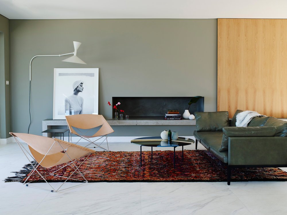
It gives me joy every time I think about it and I’m so grateful to have lovely clients who trust my judgement and advice. The key point here though - when selecting colours for a home, the clients personal taste drives the project. All I aim to do is use colour to create harmony between the architecture and the objects and furniture that a client may have collected over a lifetime. When I make a suggestion for colour placement that takes the client and architect out of their usual comfort zone, I always explain in detail why and how it will affect the spatial experience of that building to achieve (and often exceed) the project aims.
Image: Prue Ruscoe