COLOUR DESIGN WORKSHOPS FOR
ARCHITECTS + SPATIAL DESIGNERS
Learn the Foundations of Colour Design That Every Architect Needs To Know
Architects ARE ACUTELY AWARE THAT COLOUR IS ‘EVERYWHERE, ALL AT ONCE, ALL THE TIME’ and that colour is the means by which architecture is seen, and space is understood.
However, most colour training (and most architecture courses teach little or no colour theory) focus on colour theory in 2 dimensions, or they teach colour psychology in a formulaic way that doesn’t necessarily align with the way that architects think about space.
Spatial designers need colour training attuned to architectural thinking. Lymesmith’s workshops focus on unlocking the potential of colour in the design of complex three dimensional environments.
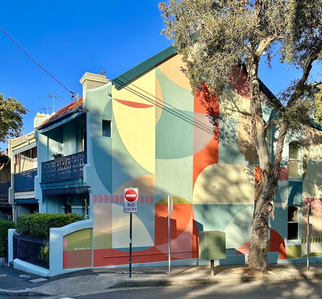
Lymesmith teaches Architectural Colour Design.
What is Architectural Colour Design?
I define good colour design as ‘colour selection and arrangement that is in service to the architecture, and to the people who will use the architecture’.
While most people have colours they love and those they’d prefer to avoid - good spatial colour design is not about individual colours at all. It’s about relationships between the colours, and the strategies used to determine the placement of those colours.
Good colour design may be very understated, hardly registering as ‘coloured’ at all. Conversely, colour may be a building’s most dominant and memorable characteristic, or it can be anywhere in between these two extremes.
Intelligent colour design is the artful combination of colour selection, colour strategy and architectural style.
Intelligent colour design;
makes buildings better for people
creates engaging, place-sensitive environments for human well-being and user engagement
connects interiors to landscapes
is about colour relationships not individual colours
is Architectural Colour Design.
10 reasons architects need Lymesmith’s colour design training
Colour cannot be avoided. Every decision made when specifying materials is a decision about colour.
Learning to see ‘colour as material’ will unlock new potential in your design practice.
Understanding how your colour strategy is as crucial as your colour palette will transform your practice.
User experience is key to every buildings’ success, colour fundamentally affects user experience.
Sensitive colour design is crucial in both trauma informed design and biophilic design.
Intelligent colour design creates better buildings for human beings.
Colour offers low budget / high impact transformations of existing buildings - can you afford to ignore it?
Colour is complex, challenging, changeable. Understand how to make it work for you.
Learning how to communicate your colour concepts effectively is part of every Lymesmith course.
Only 16% of architects are happy with their level of colour design knowledge - chances are you are one of the 84% who want to know more!
lymesmith’s Colour Workshops
If You’re Ready to Transform Your Thinking About Colour In Architecture and Embrace Colour Design For Human Well-Being, I’m Currently Offering Two Distinct Workshops.
Workshop 1
Foundations of Architectural Colour Design
There will be so many A-Ha! moments you’re sure to leave dancing. This course could also be called What You Should Have Learned about Colour at Uni but Didn’t.
Colour Theory For Architects
Loosening Your Death Grip on Vivid White
The Key Colour Strategies Every Architect Needs
What is ‘Colour Appropriate to Architecture’?
Colour Conversations with Clients
Includes colour collateral, PDF handouts and a reading list of key colour texts for architecture.
Duration: 3.5 hours
Max participants: 14
Credit: 3 CPD Points
Workshop 2
Introduction to Place Based Colour Design
This 3.5 hour session introduces Lymesmith’s philosophy of ‘place-based’ colour design. Learn to work with site and context to develop uniquely resonant colour palettes for every project.
This course includes an overview of key Lymesmith projects and an in-depth case study of my process, followed by a hands-on session designing a colour palette and experimenting with colours on a 3 dimensional space.
Materials provided - fan decks, samples, trace and coloured pencils.
Duration: 3.5 hours
Max participants: 14
Credit: 3 CPD Points
Let’s Talk
Book a 20 minute call to discuss in-house workshop options for your architecture or design practice.
Smaller practice / sole practitioner? Sign up to the workshop interest list and be the first to know about workshops in your area. If you have a group of 10-14 people ready to go, book a call to discuss your requirements.
These courses are for you if…
You know that colour has a huge impact on architecture, but you don’t know where to start.
You defer talking to your clients about colour in the early stages, but then it’s left too late and opportunities are missed.
You have two ‘go to’ paint colours you use for all your projects (and yep, you basically mean black and white!)
You’ve tried experimenting with colour but the results fell short of your expectations..
You think of colour as a surface decoration rather than as a tool that can fundamentally change the way a space is perceived.
You can put a decent colour palette together but you don’t have a clear strategy for applying it to different building types.
You want to be inspired to explore new ways of thinking about and using colour in your design practice.
You are interested in Lymesmith’s colour design philosophy and want to learn more.
You’re an architect or other spatial designer and you can relate to any of the above!
This is not for…
Finding out about the latest colour trends. Lymesmith’s philosophy of Place-Based Colour Design is the antithesis of trend driven colour design.
Learning one simple colour formula that will solve all your problems. Colour is complex.
Sitting back in silence, to watch a nice slideshow and collect your CPD points. You will be exchanging ideas about colour with the whole class. Why? Because improving your ability to communicate colour ideas with your clients and colleagues is key to you getting maximum value from the course content.
The general public or home owners. This is a course specifically for practising spatial design professionals such as architects, interior designers, landscape architects, environmental designers, set designers, etc.
About Lymesmith
I’m Sonia.
I am passionate about the potential of intelligent colour design to create a built environment that connects people to place and enhances human well-being.
My qualifications in architecture and fine arts gives me a unique insight into colour design that is attuned to the particular needs and concerns of architects.
I love helping my clients to unlock the potential of colour and material to transform buildings and create memorable places. I work with a cross section of design professionals, from sole practitioners to medium sized firms to developers and private clients, on all scales of projects in the built environment.
In 2023 I began teaching my (award winning) colour design methodology to architects and spatial designers.
SUBSCRIBE to receive the free GUIDE
Discover how Lymesmith's design method naturally leads to better colour communication by outlining the key skills you need to weave a colour story your clients will love.


