SETTING LIMITS: COLOUR IN RELATION TO PLACE
By applying the concept of the Readymade to our older housing stock the architect can become an ‘invigorating force’ of otherwise overlooked material ...
When Destroying Buildings with Colour is a Good Idea
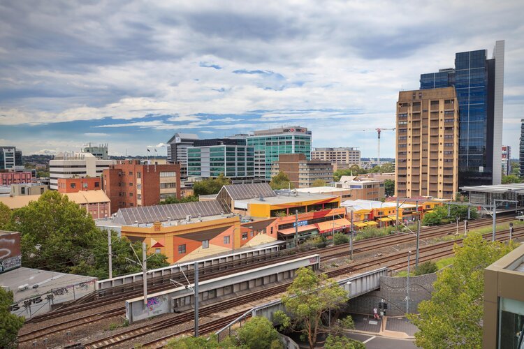
One of my earliest public commissions was the Darcy St + Laneway Activation in Parramatta. The project in question was commissioned by Parramatta Council for building assets they owned and planned to demolish. This project gave me the opportunity to destroy the buildings first, by using paint instead of a sledgehammer.
COLOUR CREATES CONNECTION
Trauma Informed Design shares many principles with Biophilic Design and as I learn more about both, it’s increasingly clear to me (and backed up by a growing body of scientific studies) that colour plays a central role in design for health and well-being. Human beings have evolved in close and complex relationship with the natural world, and our brains function better when stimulated and soothed by interaction with complex natural systems.
WHY SO WHITE?
As you may know - I am not a fan of stark whites. Whilst the colour white has its uses and place in architecture, I strongly object to its use as a ‘given’, or a default colour.
Beautiful Buildings from the Ground Up: Geological Colour Cues for Architecture
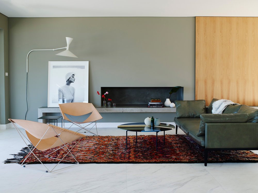
Sydney’s golden sandstone is the starting point for any contextually sensitive building colour palette in the city. Meaning, if you use white on a building in Sydney, make it a warm white. For black, make it a warm black.
HURRY TO WHERE THEY STILL (BLOOM)
Where have all the colours gone?
National Carillon as Memorial for Lost Temperate Grasslands
when client and Architect disagree on colour
I often get asked by architects; “how do you convince your clients to use particular colours, or to be bold with colour?”
Designing colour palettes
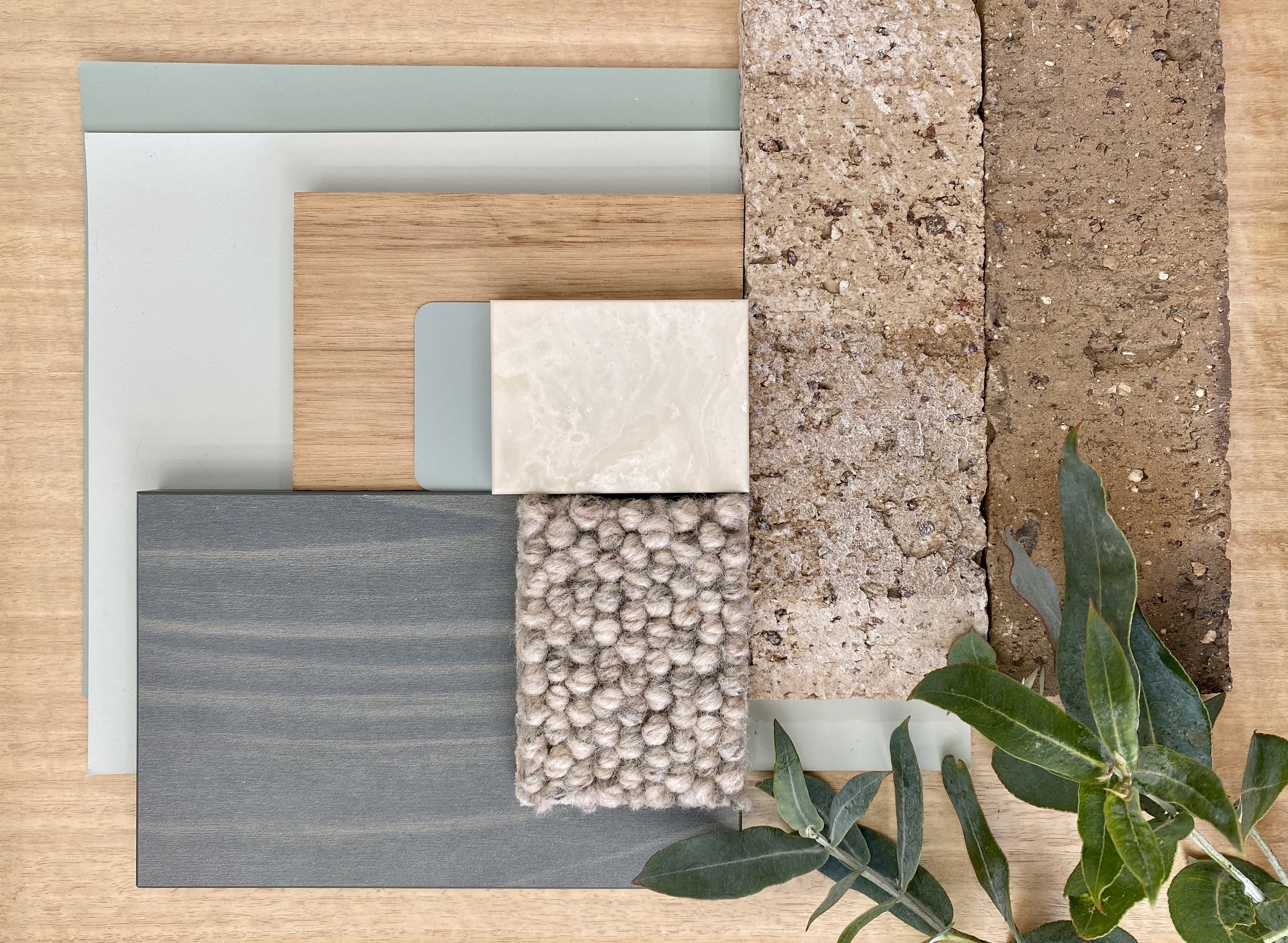
I like to create colour palettes inspired by real things in the world.
A colour wheel is not in itself a design tool.
The ‘colour world’ is much more complex and beautiful.
BLENDING INTO A CROWD : WHAT COLOUR CAN DO FOR ARCHITECTURE
Bondi Beach is big, lively, beautiful … and people certainly don’t go there to look at a ‘dunny’ block. So, for the North Bondi Public Amenities, colour was used to camouflage and harmonise the toilets with the environment rather than to make them stand out.
boldly go your own way : WHAT COLOUR CAN DO FOR ARCHITECTURE
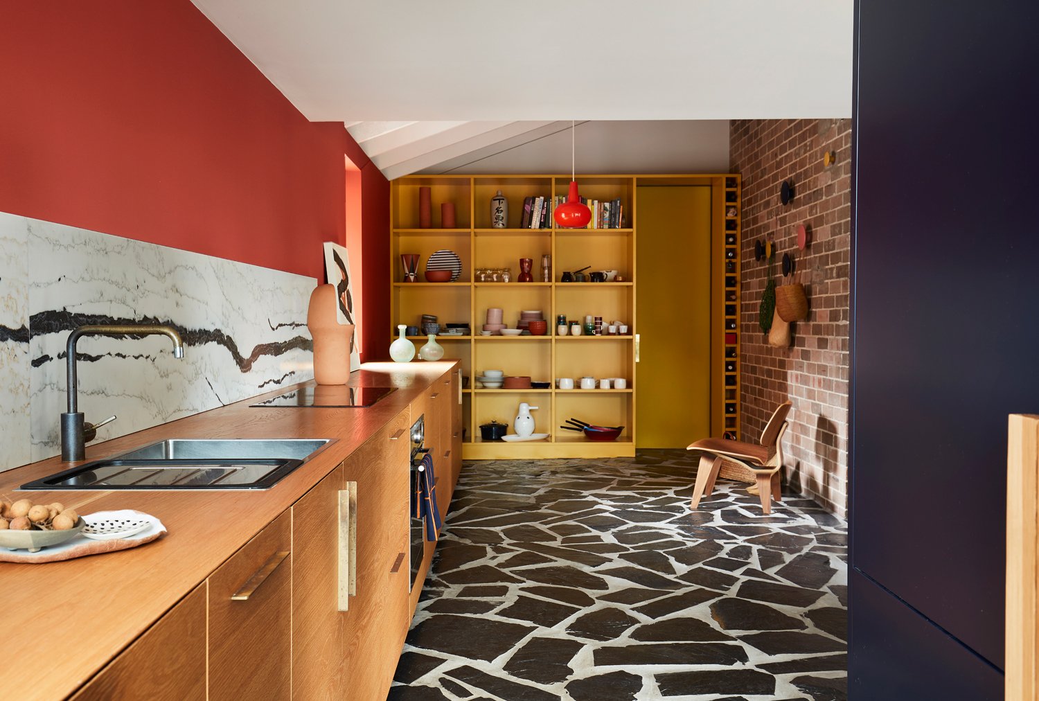
So many houses exhibit the same neutral colour schemes. Intended to be polite, they avoid scrutiny and arouse little passion. I believe generic colour schemes disengage the end user.
COLOUR IS POLITICAL
In architecture, colour is often thought of as dangerous, because of its capacity to destroy the perception of form. It’s thought of as trivial, because of its association with decoration, with the primitive, and with the feminine. Colour is political.
COLOUR UNDONE
Weathering of the surface over time, the UV fading, a different brand of paint with different gloss level, all these things make it nearly impossible to patch a painted wall…
GREY, BEIGE OR GREIGE?
So many public buildings exhibit the same old white/grey or beige/greige colour schemes… Intended to be polite and neutral, they avoid scrutiny or comment. It is commonly thought that neutrals will be liked by the greatest number of people. I’d like to see the research on that.
WHITEWASHING
White shines best when in the companionship of other colours. It’s the interplay of colour that creates magic and joy.


