
SETTING LIMITS: COLOUR IN RELATION TO PLACE
Colours are always a reflection of the company they keep.
Even the most beautiful colour can appear out of place or awkward in the wrong company or the wrong place.

Colour Concept Sketches by Lymesmith. Architect: Mark Szczerbicki Architects
WHY GENERATING COLOUR PALETTES IN RESPONSE TO PLACE IS A DECISION MAKING TOOL
I never start a project by saying 'hey, this is a nice colour, let's use it.'
I approach colour design as a process of deduction. Starting with site, and the method I call Place-Based Colour Design I make colour selection easier and faster by limiting the field of possibilities from the beginning. Your site is a reference point that limits your options (and by options I mean hundreds or even thousands of potential colours) to enable decision making.
As every designer knows, limits are good. Limits are what push our creativity and allow us to move forward with the work. It's the same with colour design - start with the context, and the constraints - and then the colour selection follows, without the overwhelm.
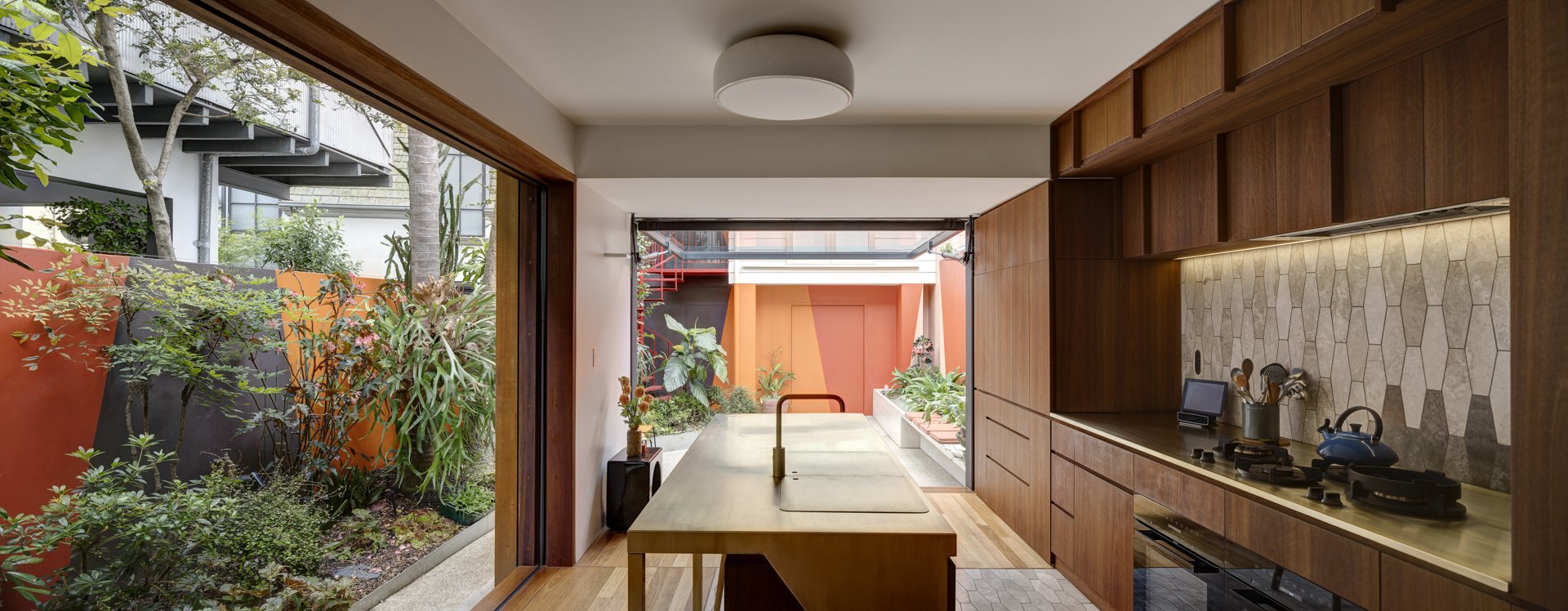
In Place-Based Colour Design, 'limits' include the existing conditions of a site, and perhaps the design work that's already been done. In the case of the project sketches below, the limit is the garden, the colour characteristics of the selected plants, the views to the neighbouring buildings, and the fact that it's a shady cool space that is overshadowed a lot of the time. All these factors led me to develop a very warm and vibrant palette for the courtyard walls, to make it as inviting as possible and to create the feeling that the courtyard is not separate from the interior but simply an extension of the living space.

Concept sketches - understanding the project context.

Concept sketches - introducing colour into the context.
There's so much to say about limits. In this project, a very curious thing happened when the courtyard walls were painted. Aside from the fact that the warm colours beautifully highlighted the deep greens of the garden, they also made the interior space feel so much larger - suddenly it felt like the courtyard walls were the walls of the house - the limit point (ie the walls) of the 'house' magically dissolved and a new limit point was created. Colour is surprising, constantly playing tricks with our perceptions and enriching our experience of space. There's risk in colour, but also great rewards, and pleasure to be gained.
The choice of colours we have available is seemingly without limits (just go to any paint shop colour wall to experience the burden of too much choice). Limits are what we most need to understand, and explain to our clients. Working with ‘place’ (i.e, the site context) is a most helpful first step in defining the limits of a given project.
Victorian Terrace renovation by Sam Crawford Architects, exterior colour design by Lymesmith
I teach my method of ‘contextual limit setting’ in Workshop 2: Introduction to Place Based Colour Design.
The workshops are designed so that small practice and solo practitioners (like me!) can access affordable, high quality CPD and professional development in this specialised area of design. The courses will challenge your colour prejudices, teach you the importance of architectural colour strategies, and build your confidence with colour.
Workshop 1 covers: An Introduction to Colour Theory for Spatial Designers, Understanding Architectural Colour Strategies, What Makes a Colour ‘Appropriate to Architecture', How to Have Colour Conversations with Clients, Why you need to loosen your death grip on Vivid White, and more!
Workshop 2: Introduction to Place Based Colour Design introduces Lymesmith’s philosophy and methodology for creating ‘place-based’ colour palettes for the built environment. Through case studies and hands on exercises you will learn to develop uniquely resonant colour palettes for every project.
Curious? More info HERE