SETTING LIMITS: COLOUR IN RELATION TO PLACE
By applying the concept of the Readymade to our older housing stock the architect can become an ‘invigorating force’ of otherwise overlooked material ...
ARCHITECTURE AND THE READYMADE
By applying the concept of the Readymade to our older housing stock the architect can become an ‘invigorating force’ of otherwise overlooked material ...
LOOSEN YOUR DEATH GRIP ON VIVID WHITE
In every era, colour palettes shift in response to the social, cultural and political landscape.
COLOUR CREATES CONNECTION
Trauma Informed Design shares many principles with Biophilic Design and as I learn more about both, it’s increasingly clear to me (and backed up by a growing body of scientific studies) that colour plays a central role in design for health and well-being. Human beings have evolved in close and complex relationship with the natural world, and our brains function better when stimulated and soothed by interaction with complex natural systems.
This might not work
How often do we say to our clients, this might not work? A few days after a very bold colour concept had been accepted by our client, the architect called me and asked, “Sonia, how confident are you that this is actually going to work?”
THERE ARE NO BAD COLOURS
There are colours that are inherently unsuitable for architecture, but white is not one of them, white is very useful.
when client and Architect disagree on colour
I often get asked by architects; “how do you convince your clients to use particular colours, or to be bold with colour?”
my love for murals
When I design a mural, I am trying to make a work that responds to, and is inspired by the place, or the context of the mural – that is – the physical environment, the architecture itself, and the surrounding environment.
Creating an inner world : WHAT COLOUR CAN DO FOR INTERIORS
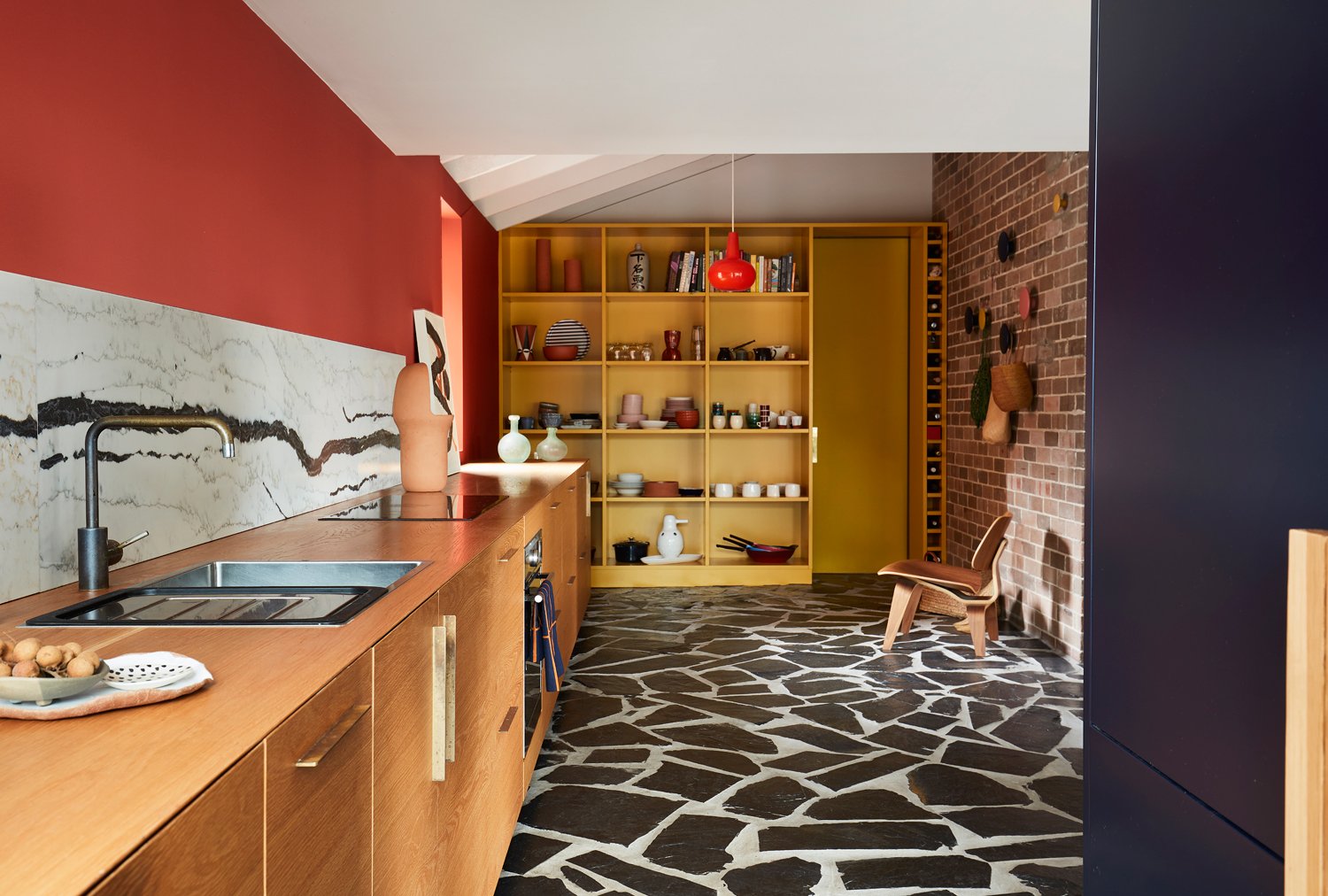
The colours for this refurbishment of a former Bourke Street Bakery, into Paper Bird (a modern Korean) restaurant in Potts Point, created a kind of inner world.
The opportunity offered by the semi underground space allowed us to create a self contained world, with a unique atmosphere.
Designing colour palettes
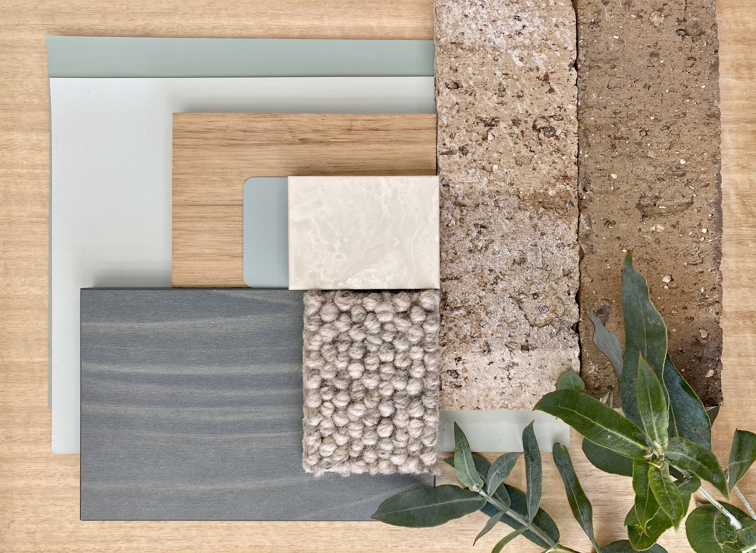
I like to create colour palettes inspired by real things in the world.
A colour wheel is not in itself a design tool.
The ‘colour world’ is much more complex and beautiful.
BLENDING INTO A CROWD : WHAT COLOUR CAN DO FOR ARCHITECTURE
Bondi Beach is big, lively, beautiful … and people certainly don’t go there to look at a ‘dunny’ block. So, for the North Bondi Public Amenities, colour was used to camouflage and harmonise the toilets with the environment rather than to make them stand out.
boldly go your own way : WHAT COLOUR CAN DO FOR ARCHITECTURE
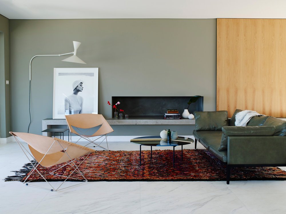
So many houses exhibit the same neutral colour schemes. Intended to be polite, they avoid scrutiny and arouse little passion. I believe generic colour schemes disengage the end user.
COLOUR IS POLITICAL
In architecture, colour is often thought of as dangerous, because of its capacity to destroy the perception of form. It’s thought of as trivial, because of its association with decoration, with the primitive, and with the feminine. Colour is political.
GREY, BEIGE OR GREIGE?
So many public buildings exhibit the same old white/grey or beige/greige colour schemes… Intended to be polite and neutral, they avoid scrutiny or comment. It is commonly thought that neutrals will be liked by the greatest number of people. I’d like to see the research on that.


