SETTING LIMITS: COLOUR IN RELATION TO PLACE
By applying the concept of the Readymade to our older housing stock the architect can become an ‘invigorating force’ of otherwise overlooked material ...
ARCHITECTURE AND THE READYMADE
By applying the concept of the Readymade to our older housing stock the architect can become an ‘invigorating force’ of otherwise overlooked material ...
LOOSEN YOUR DEATH GRIP ON VIVID WHITE
In every era, colour palettes shift in response to the social, cultural and political landscape.
COLOUR MAGIC ‘BETWEEN MOUNTAINS’
I got this job because of poor architectural design. Art to the rescue!
choosing your colour strategy
Colour in Architecture takes many forms and can be expressed or used in wildly different ways.
When Destroying Buildings with Colour is a Good Idea
One of my earliest public commissions was the Darcy St + Laneway Activation in Parramatta. The project in question was commissioned by Parramatta Council for building assets they owned and planned to demolish. This project gave me the opportunity to destroy the buildings first, by using paint instead of a sledgehammer.
COLOUR CREATES CONNECTION
Trauma Informed Design shares many principles with Biophilic Design and as I learn more about both, it’s increasingly clear to me (and backed up by a growing body of scientific studies) that colour plays a central role in design for health and well-being. Human beings have evolved in close and complex relationship with the natural world, and our brains function better when stimulated and soothed by interaction with complex natural systems.
IF BEAUTY IS IN THE EYE OF THE BEHOLDER…
It’s not our eyes that see colour, it’s our brains. And we don’t see colour objectively, we see it through a lens of culture, memory, fashion, personal and social history; we see colours in relation to each other.
When the Opposite is True
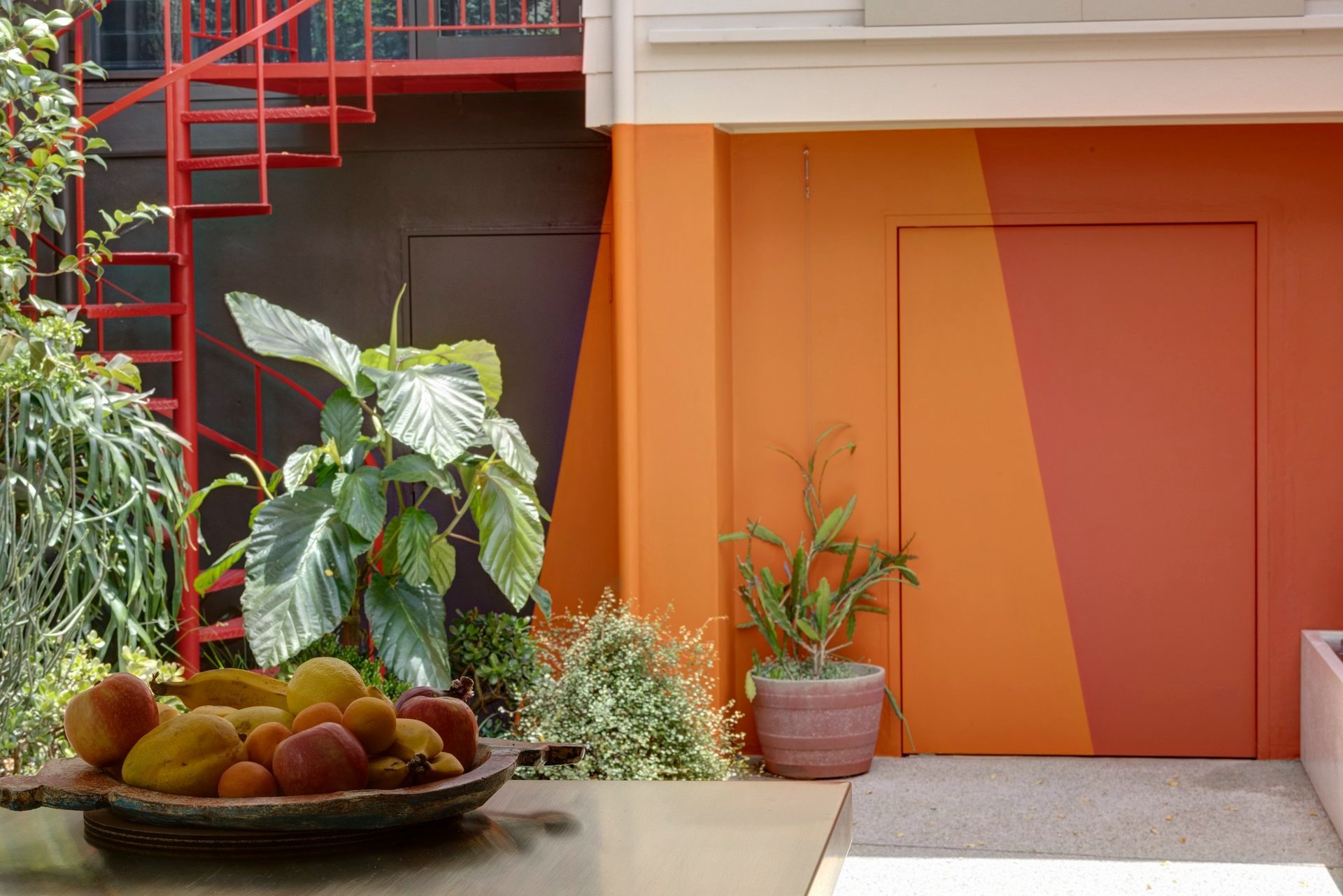
‘Warm Vessel’ is the name of a recent project in Darlinghurst, in which I was asked to propose a colour strategy for a small courtyard garden. This involved painting the back walls of the terrace house, the side boundary walls and the façade of the studio/garage that formed the rear boundary and enclosed the courtyard.
This might not work
How often do we say to our clients, this might not work? A few days after a very bold colour concept had been accepted by our client, the architect called me and asked, “Sonia, how confident are you that this is actually going to work?”
THERE ARE NO BAD COLOURS
There are colours that are inherently unsuitable for architecture, but white is not one of them, white is very useful.
WHY SO WHITE?
As you may know - I am not a fan of stark whites. Whilst the colour white has its uses and place in architecture, I strongly object to its use as a ‘given’, or a default colour.
Beautiful Buildings from the Ground Up: Geological Colour Cues for Architecture
Sydney’s golden sandstone is the starting point for any contextually sensitive building colour palette in the city. Meaning, if you use white on a building in Sydney, make it a warm white. For black, make it a warm black.
HURRY TO WHERE THEY STILL (BLOOM)
Where have all the colours gone?
National Carillon as Memorial for Lost Temperate Grasslands
when client and Architect disagree on colour
I often get asked by architects; “how do you convince your clients to use particular colours, or to be bold with colour?”
my love for murals
When I design a mural, I am trying to make a work that responds to, and is inspired by the place, or the context of the mural – that is – the physical environment, the architecture itself, and the surrounding environment.
Creating an inner world : WHAT COLOUR CAN DO FOR INTERIORS
The colours for this refurbishment of a former Bourke Street Bakery, into Paper Bird (a modern Korean) restaurant in Potts Point, created a kind of inner world.
The opportunity offered by the semi underground space allowed us to create a self contained world, with a unique atmosphere.
Designing colour palettes
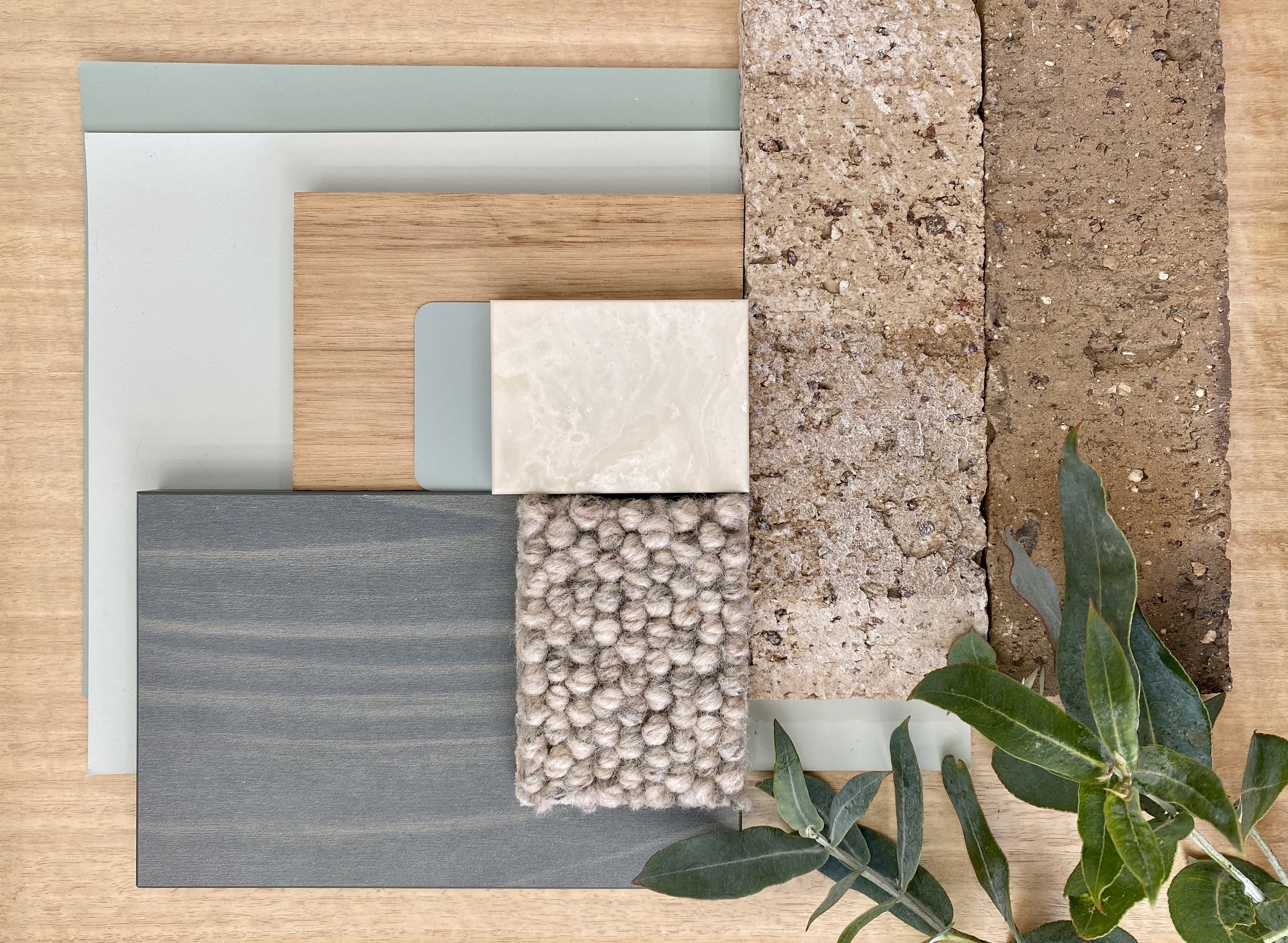
I like to create colour palettes inspired by real things in the world.
A colour wheel is not in itself a design tool.
The ‘colour world’ is much more complex and beautiful.
BLENDING INTO A CROWD : WHAT COLOUR CAN DO FOR ARCHITECTURE
Bondi Beach is big, lively, beautiful … and people certainly don’t go there to look at a ‘dunny’ block. So, for the North Bondi Public Amenities, colour was used to camouflage and harmonise the toilets with the environment rather than to make them stand out.


