When the Opposite is True
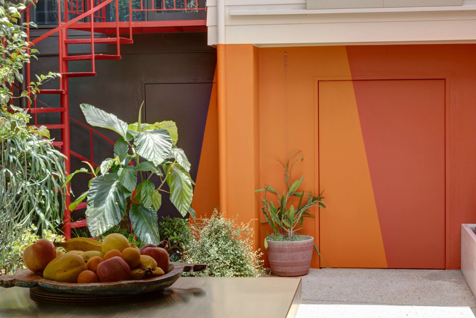
‘Warm Vessel’ is the name of a recent project in Darlinghurst, in which I was asked to propose a colour strategy for a small courtyard garden. This involved painting the back walls of the terrace house, the side boundary walls and the façade of the studio/garage that formed the rear boundary and enclosed the courtyard.
my love for murals
When I design a mural, I am trying to make a work that responds to, and is inspired by the place, or the context of the mural – that is – the physical environment, the architecture itself, and the surrounding environment.
BLENDING INTO A CROWD : WHAT COLOUR CAN DO FOR ARCHITECTURE
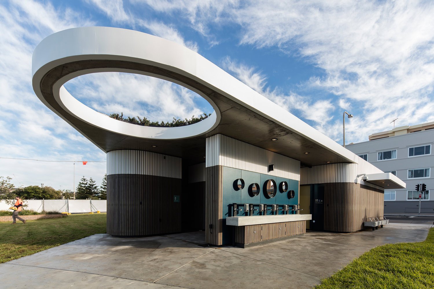
Bondi Beach is big, lively, beautiful … and people certainly don’t go there to look at a ‘dunny’ block. So, for the North Bondi Public Amenities, colour was used to camouflage and harmonise the toilets with the environment rather than to make them stand out.
WAREEMBA BOOGIE WOOGIE
Wareemba Boogie Woogie mural connects different elements, bringing them together in a choreographed dance for the pure pleasure of those who live and visit there, it celebrates good neighbours and enriches a quiet suburban street corner.
COLOUR UNDONE
Weathering of the surface over time, the UV fading, a different brand of paint with different gloss level, all these things make it nearly impossible to patch a painted wall…
STANDARDS (AS2700-2011)
I love the Australian Standards colour palette (AS2700-2011). It’s partially because the colour names represent place-based things: Waratah Red, Wattle Yellow, Koala Grey, Blue Gum, Wombat and Bondi Blue, to mention just a few.


