STANDARDS (AS2700-2011)
Standards - ideals; principles; yardsticks; patterns; specifications.
I love the Australian Standards colour palette (AS2700-2011). It’s partially because the colour names represent place-based things: Waratah Red, Wattle Yellow, Koala Grey, Blue Gum, Wombat and Bondi Blue, to mention just a few.
The whole palette is derived from the colours of real things – Shell Pink, Oyster Grey, Ghost Gum, Mustard, Apricot. And yes, they are spot on.
Cootamundra is one of my favourites, a classic, soft, ambiguous, greyish blueish green. The name always makes me smile because my mum was born in Coota, and has always referred to it as ‘Cootabloodymundra’.
Each colour has a story and encapsulates a tangible, physical quality or experience of ‘colour in the world’. I love that a single flat colour (which is purely abstract) can connect us with something real, and the AS2700 palette is a brilliant example of exactly that.
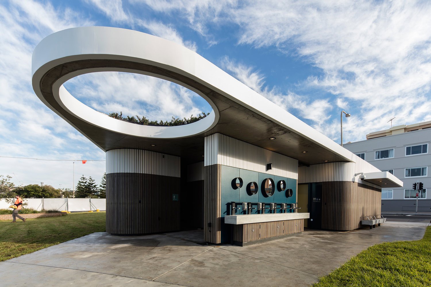
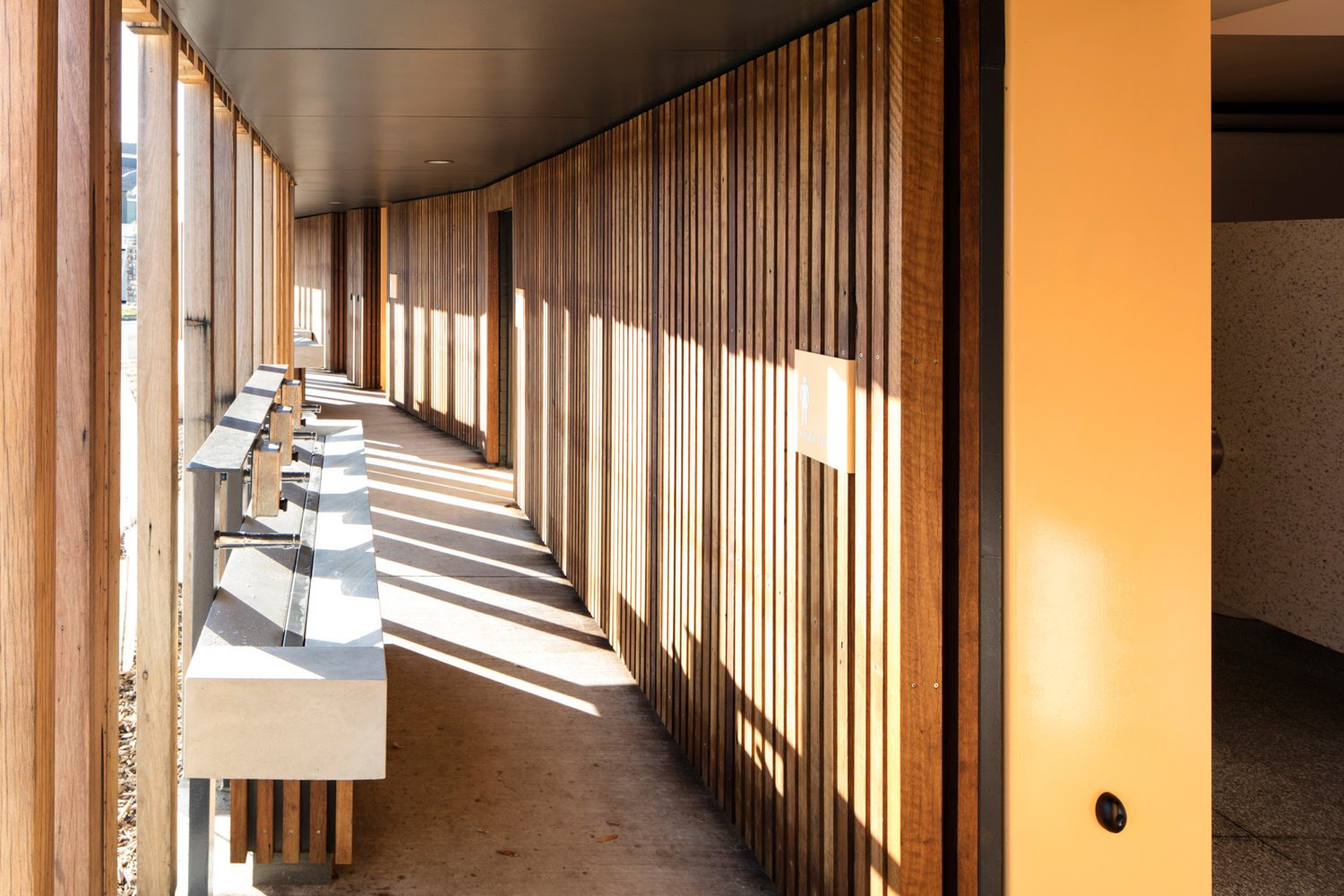
The North Bondi Amenities project features Cootamundra, Opaline, Khaki, White, and Teal from this special Australian colour palette.
Project Team
Architecture: Sam Crawford Architects
Builder: Grindley Interiors
Project Manager: Complete Urban
Structural Engineer: Cantilever
Graphic Design: Deuce Design
Photography: Brett Boardman


