boldly go your own way : WHAT COLOUR CAN DO FOR ARCHITECTURE
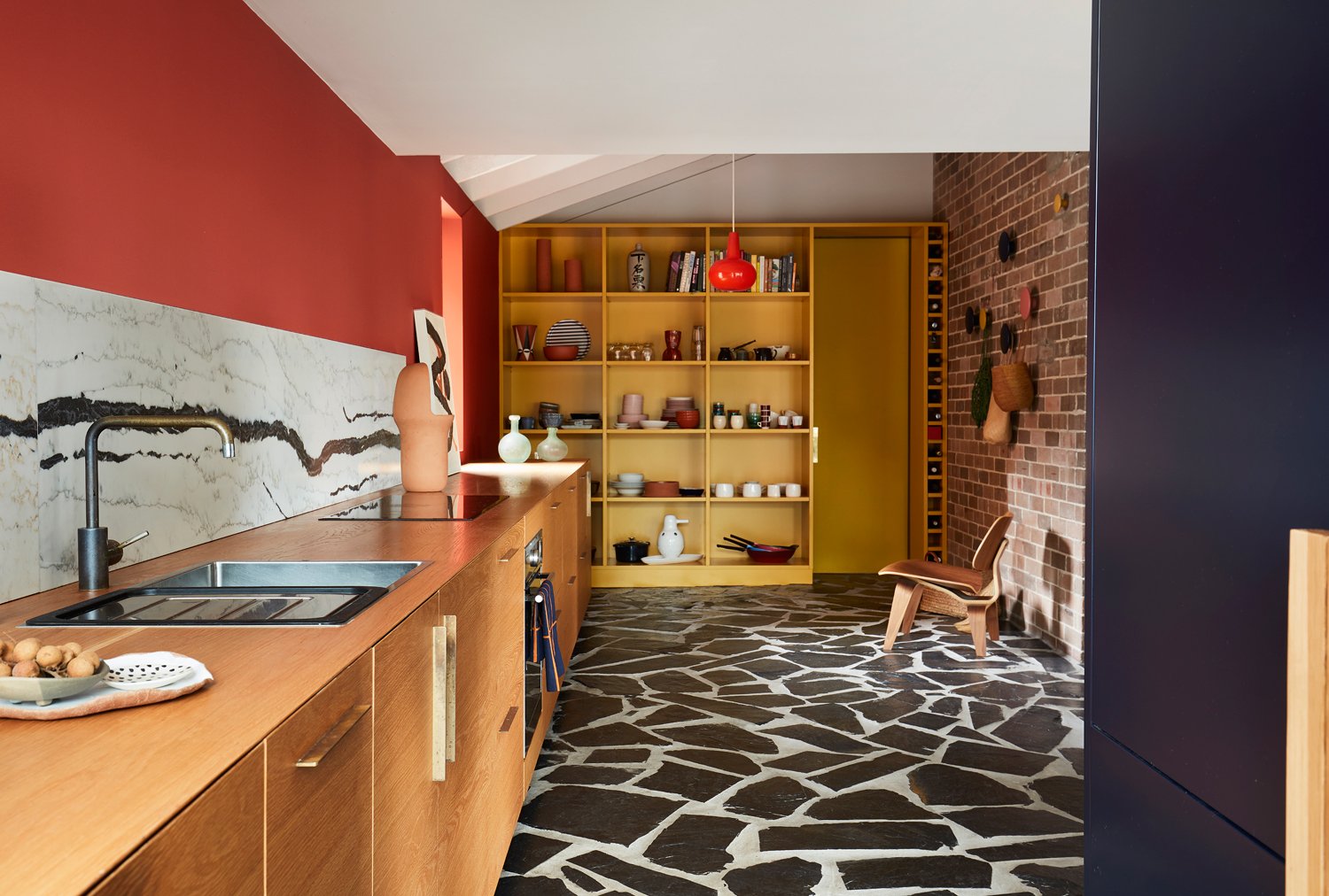
So many houses exhibit the same neutral colour schemes. Intended to be polite, they avoid scrutiny and arouse little passion. I believe generic colour schemes disengage the end user.
WAREEMBA BOOGIE WOOGIE
Wareemba Boogie Woogie mural connects different elements, bringing them together in a choreographed dance for the pure pleasure of those who live and visit there, it celebrates good neighbours and enriches a quiet suburban street corner.
COLOUR IS POLITICAL
In architecture, colour is often thought of as dangerous, because of its capacity to destroy the perception of form. It’s thought of as trivial, because of its association with decoration, with the primitive, and with the feminine. Colour is political.
COLOUR UNDONE
Weathering of the surface over time, the UV fading, a different brand of paint with different gloss level, all these things make it nearly impossible to patch a painted wall…
GREY, BEIGE OR GREIGE?
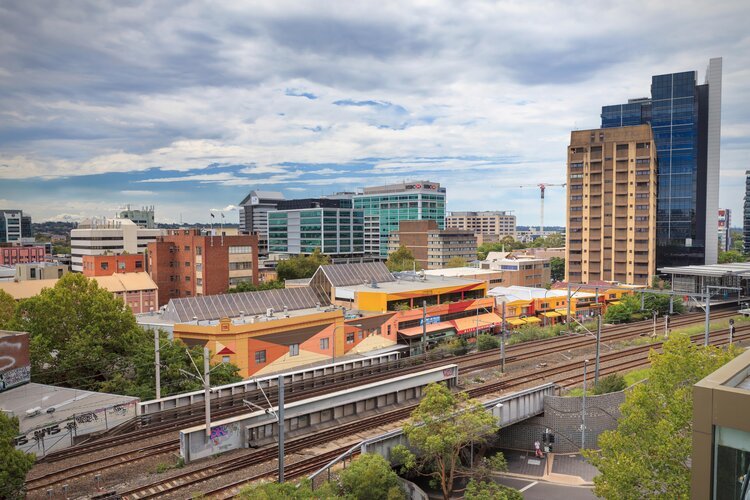
So many public buildings exhibit the same old white/grey or beige/greige colour schemes… Intended to be polite and neutral, they avoid scrutiny or comment. It is commonly thought that neutrals will be liked by the greatest number of people. I’d like to see the research on that.
WHITEWASHING
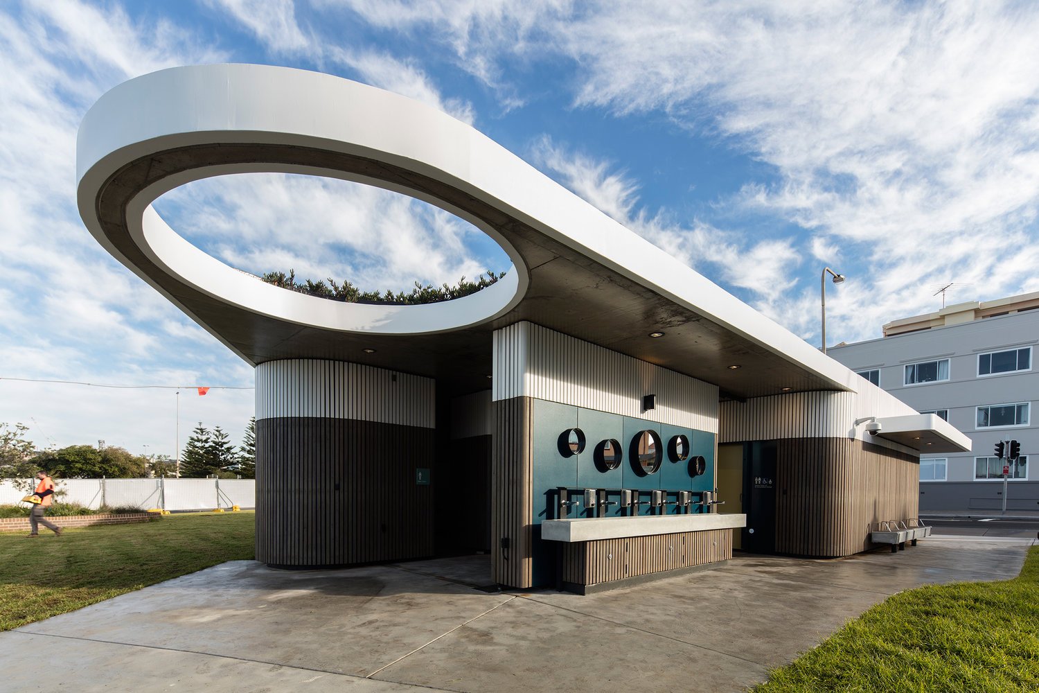
White shines best when in the companionship of other colours. It’s the interplay of colour that creates magic and joy.
STANDARDS (AS2700-2011)
I love the Australian Standards colour palette (AS2700-2011). It’s partially because the colour names represent place-based things: Waratah Red, Wattle Yellow, Koala Grey, Blue Gum, Wombat and Bondi Blue, to mention just a few.


